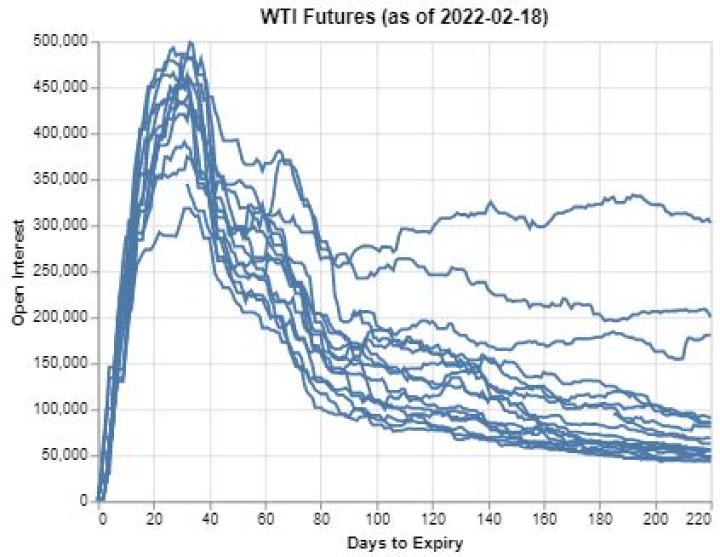
I am trying to create a chart tracking 19 different columns of data and am looking to set a pre-defined color code for each different layer.
base = alt.Chart(historical_WTI.loc['0': '220'].reset_index(), title=f"WTI Futures (as of {last_date})").mark_line().encode( x = alt.X('days_to_expiry', title = 'Days to Expiry'), y = alt.Y(alt.repeat('layer'), scale=alt.Scale(zero = False), type="quantitative", title = 'Open Interest'), color = alt.Color('Key:O', scale = alt.Scale(domain = WTI_securities, range = color_list)) ).repeat(layer = historical_WTI.columns.values.tolist()) base WTI_securities and color_list are both lists that are in the order requried for my mapping but I am returned with the following chart
when I comment out the color line, I am able to get the following chart but I need the color mapping and legend.
anyone knows what I am doing wrong?
11 Answer
Don't know if this answers your question, but I started from this example:
adding the configure_range.
import altair as alt from vega_datasets import data source = data.movies() colors = ['#7fc97f','#beaed4','#fdc086'] alt.Chart(source).mark_line().encode( x=alt.X("IMDB_Rating", bin=True), y=alt.Y( alt.repeat("layer"), aggregate="mean", title="Mean of US and Worldwide Gross" ), color=alt.datum(alt.repeat("layer")), ).repeat( layer=["US_Gross", "Worldwide_Gross", "Production_Budget"], ).configure_range( category=alt.RangeScheme(colors) ) Which gives me this: