I'm trying to use my own labels for a Seaborn barplot with the following code:
import pandas as pd import seaborn as sns fake = pd.DataFrame({'cat': ['red', 'green', 'blue'], 'val': [1, 2, 3]}) fig = sns.barplot(x = 'val', y = 'cat', data = fake, color = 'black') fig.set_axis_labels('Colors', 'Values') 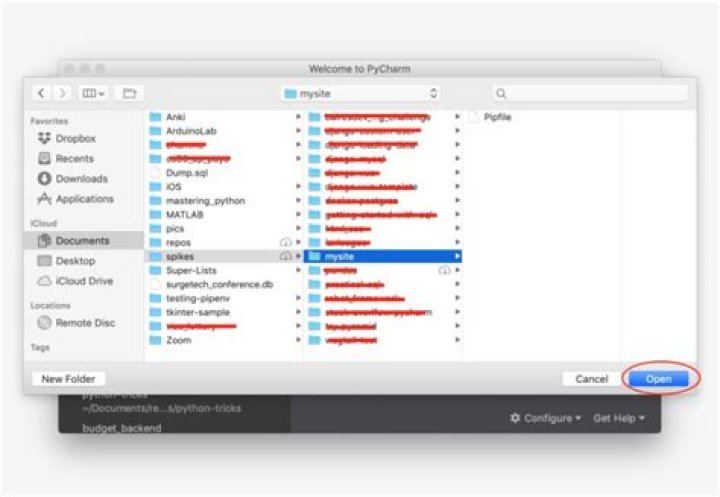
However, I get an error that:
AttributeError: 'AxesSubplot' object has no attribute 'set_axis_labels' What gives?
4 Answers
Seaborn's barplot returns an axis-object (not a figure). This means you can do the following:
import pandas as pd import seaborn as sns import matplotlib.pyplot as plt fake = pd.DataFrame({'cat': ['red', 'green', 'blue'], 'val': [1, 2, 3]}) ax = sns.barplot(x = 'val', y = 'cat', data = fake, color = 'black') ax.set(xlabel='common xlabel', ylabel='common ylabel') plt.show() One can avoid the AttributeError brought about by set_axis_labels() method by using the matplotlib.pyplot.xlabel and matplotlib.pyplot.ylabel.
matplotlib.pyplot.xlabel sets the x-axis label while the matplotlib.pyplot.ylabel sets the y-axis label of the current axis.
Solution code:
import pandas as pd import seaborn as sns import matplotlib.pyplot as plt fake = pd.DataFrame({'cat': ['red', 'green', 'blue'], 'val': [1, 2, 3]}) fig = sns.barplot(x = 'val', y = 'cat', data = fake, color = 'black') plt.xlabel("Colors") plt.ylabel("Values") plt.title("Colors vs Values") # You can comment this line out if you don't need title plt.show(fig) Output figure:
You can also set the title of your chart by adding the title parameter as follows
ax.set(xlabel='common xlabel', ylabel='common ylabel', title='some title') Another way of doing it, would be to access the method directly within the seaborn plot object.
import pandas as pd import seaborn as sns import matplotlib.pyplot as plt fake = pd.DataFrame({'cat': ['red', 'green', 'blue'], 'val': [1, 2, 3]}) ax = sns.barplot(x = 'val', y = 'cat', data = fake, color = 'black') ax.set_xlabel("Colors") ax.set_ylabel("Values") ax.set_yticklabels(['Red', 'Green', 'Blue']) ax.set_title("Colors vs Values") Produces: