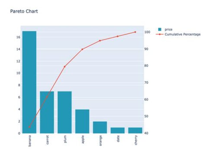
I was trying to plot barplot and scatterplot in the same plot in plotly, but it shows only scatterplot.
How to show both the plots?
data
import numpy as np import pandas as pd import seaborn as sns import matplotlib.pyplot as plt from matplotlib.ticker import PercentFormatter import plotly import plotly.offline as py import plotly.graph_objs as go import plotly.figure_factory as ff import plotly.tools as tls from plotly.subplots import make_subplots from plotly.offline import plot, iplot, init_notebook_mode init_notebook_mode(connected=False) df = pd.DataFrame({ 'price': [ 4.0, 17.0, 7.0, 7.0, 2.0, 1.0, 1.0], 'item': ['apple', 'banana', 'carrot', 'plum', 'orange', 'date', 'cherry']}) df = df.sort_values(num,ascending=False) df['cumulative_sum'] = df[num].cumsum() df['cumulative_perc'] = 100*df['cumulative_sum']/df[num].sum() df['demarcation'] = 80 num = 'price' cat = 'item' title = 'Pareto Chart' Code
trace1 = go.Bar( x=df[cat], y=df[num], name=num, marker=dict( color='rgb(34,163,192)' ) ) trace2 = go.Scatter( x=df[cat], y=df['cumulative_perc'], name='Cumulative Percentage', yaxis='y2', ) data = [trace1,trace2] fig = dict(data=data) iplot(fig) Output
Required
- show both barchart and scatterplot
- barchart y-ticks on left y-axis
- scatterplot y-ticks on right y-axis
- xticklabels rotate 90 degree
3 Answers
Try this:
import plotly.graph_objects as go from plotly.subplots import make_subplots trace1 = go.Bar( x=df[cat], y=df[num], name=num, marker=dict( color='rgb(34,163,192)' ) ) trace2 = go.Scatter( x=df[cat], y=df['cumulative_perc'], name='Cumulative Percentage', yaxis='y2' ) fig = make_subplots(specs=[[{"secondary_y": True}]]) fig.add_trace(trace1) fig.add_trace(trace2,secondary_y=True) fig['layout'].update(height = 600, width = 800, title = title,xaxis=dict( tickangle=-90 )) iplot(fig) Gives,
You can do something like so:
fig = make_subplots(rows=1, cols=2) fig.add_trace(trace1, row=1, col=1) fig.add_trace(trace2, row=1, col=2) fig.update_layout(xaxis=dict(tickangle=90)) fig.show() Which will produce the following graph:
- matplotlib twinx() function can instantiate a second axes that shares the same x-axis.
plt.xticks(rotation=90)to rotate x axis label.z-orderto specify the drawing order.
import pandas as pd import matplotlib.pyplot as plt df = pd.DataFrame({ 'price': [ 4.0, 17.0, 7.0, 7.0, 2.0, 1.0, 1.0], 'item': ['apple', 'banana', 'carrot', 'plum', 'orange', 'date', 'cherry']}) num = 'price' cat = 'item' df = df.sort_values(num, ascending=False) df['cumulative_sum'] = df[num].cumsum() df['cumulative_perc'] = 100*df['cumulative_sum']/df[num].sum() df['demarcation'] = 80 title = 'Pareto Chart' plt.figure(figsize=(9, 3)) axes1 = plt.subplot() b = axes1.bar(df[cat], df[num], label='Price') plt.xticks(rotation=90) # use twinx() function to create the second axis object “ax2” axes2 = axes1.twinx() p = axes2.plot(df[cat], df['cumulative_perc'], c='r', marker='o', zorder=5, label='Cumulative Percentage') axes1.legend(handles=(b, p[0]), loc='center right') plt.tight_layout() plt.show()