Consider the following example:
library(ggplot) set.seed(1e3) n <- 1e3 dt <- data.frame( age = 50*rbeta(n, 5, 1), value = 1000*rbeta(n, 1, 3) ) And let's assume that you are interested by the relative behavior of value within each band of age.
dt %>% ggplot(aes(x = age, y = value)) + geom_bin2d() would provide an "absolute" map of the data (even if using geom_bin2d(aes(fill = ..density..)) which divide the whole data by total counts). Is there a way to achieve initial goal i.e. to rescale counts for each "column" (each group of age created by geom_bin2d()) in order to unbias comparison due to sample size in each group?
Would like to stick with "maps" since they are quite relevant when there is a lot of underlying data, but other approach is welcome.
1 Answer
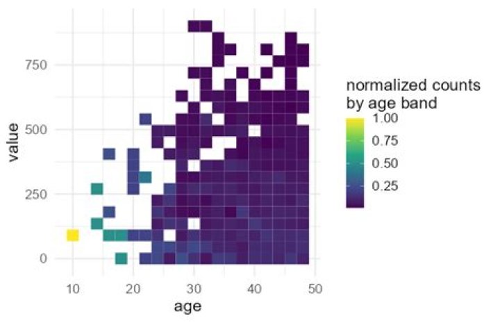
When you are trying to do something a bit different from what the standard ggplot summary functions are used for, you often find it is easier to just manipulate the data yourself. For example, you can easily bin the data yourself using findInterval, then normalize each age band using standard dplyr functions. Then you are free to plot however you like, using a plain geom_tile without trying to coax a more complex calculation out of ggplot.
library(ggplot2) library(dplyr) dt %>% mutate(age = seq(10, 50, 2)[findInterval(dt$age, seq(10, 50, 2))]) %>% mutate(value = seq(0, 1000, 45)[findInterval(dt$value, seq(0, 1000, 45))]) %>% count(age, value) %>% group_by(age) %>% mutate(n = n/sum(n)) %>% ggplot(aes(age, value, fill = n)) + geom_tile() + scale_fill_viridis_c(name = 'normalized counts\nby age band') + theme_minimal(base_size = 16)