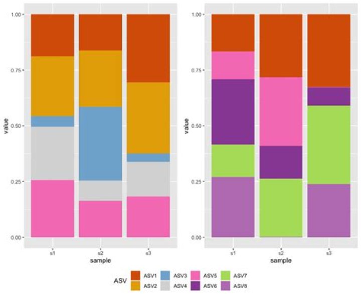
I'm trying to plot two graphs side-by-side with one common legend that incorporates all the variables between both graphs (some vars are different between the graphs).
Here's a mock example of what I've been attempting:
#make relative abundance values for n rows makeData <- function(n){ n <- n x <- runif(n, 0, 1) y <- x / sum(x) } #make random matrices filled with relative abundance values makeDF <- function(col, rw){ df <- matrix(ncol=col, nrow=rw) for(i in 1:ncol(df)){ df[,i] <- makeData(nrow(df)) } return(df) } #create df1 and assign col names df1 <- makeDF(4, 5) colSums(df1) #verify relative abundance values = 1 df1 <- as.data.frame(df1) colnames(df1) <- c("taxa","s1", "s2", "s3") df1$taxa <- c("ASV1", "ASV2", "ASV3", "ASV4", "ASV5") #repeat for df2 df2 <- makeDF(4,5) df2 <- as.data.frame(df2) colnames(df2) <- c("taxa","s1", "s2", "s3") df2$taxa <- c("ASV1", "ASV5", "ASV6", "ASV7", "ASV8") # convert wide data format to long format -- for plotting library(reshape2) makeLong <- function(df){ df.long <- melt(df, id.vars="taxa", measure.vars=grep("s\\d+", names(df), val=T), variable.name="sample", value.name="value") return(df.long) } df1 <- makeLong(df1) df2 <- makeLong(df2) #generate distinct colours for each asv taxas <- union(df1$taxa, df2$taxa) library("RColorBrewer") qual_col_pals = brewer.pal.info[brewer.pal.info$category == 'qual',] colpals <- qual_col_pals[c("Set1", "Dark2", "Set3"),] #select colour palettes col_vector = unlist(mapply(brewer.pal, colpals$maxcolors, rownames(colpals))) taxa.col=sample(col_vector, length(taxas)) names(taxa.col) <- taxas # plot using ggplot library(ggplot2) plotdf2 <- ggplot(df2, aes(x=sample, y=value, fill=taxa)) + geom_bar(stat="identity")+ scale_fill_manual("ASV", values = taxa.col) plotdf1 <- ggplot(df1, aes(x=sample, y=value, fill=taxa)) + geom_bar(stat="identity")+ scale_fill_manual("ASV", values = taxa.col) #combine plots to one figure and merge legend library(ggpubr) ggpubr::ggarrange(plotdf1, plotdf2, ncol=2, nrow=1, common.legend = T, legend="bottom") (if you have suggestions on how to generate better mock data, by all means!)
When I run my code, I am able to get the two graphs in one figure, but the legend does not incorporate all variables from both plots:

I ideally would like to avoid having repeat variables in the legend, such as: 
From what I've searched online, the legend only works when the variables are the same between graphs, but in my case I have similar and different variables.
Thanks for any help!
1 Answer
Maybe this is what you are looking for:
Convert your
taxavariables to factor with the levels equal to yourtaxasvariable, i.e. to include all levels from both datasets.Add argument
drop=FALSEto both scale_fill_manual to prevent dropping of unused factor levels.
Note: I only added the relevant parts of the code and set the seed to 42 at the beginning of the script.
set.seed(42) df1$taxa <- factor(df1$taxa, taxas) df2$taxa <- factor(df2$taxa, taxas) # plot using ggplot library(ggplot2) plotdf2 <- ggplot(df2, aes(x=sample, y=value, fill=taxa)) + geom_bar(stat="identity") + scale_fill_manual("ASV", values = taxa.col, drop = FALSE) plotdf1 <- ggplot(df1, aes(x=sample, y=value, fill=taxa)) + geom_bar(stat="identity")+ scale_fill_manual("ASV", values = taxa.col, drop = FALSE) #combine plots to one figure and merge legend library(ggpubr) ggpubr::ggarrange(plotdf1, plotdf2, ncol=2, nrow=1, common.legend = T, legend="bottom")