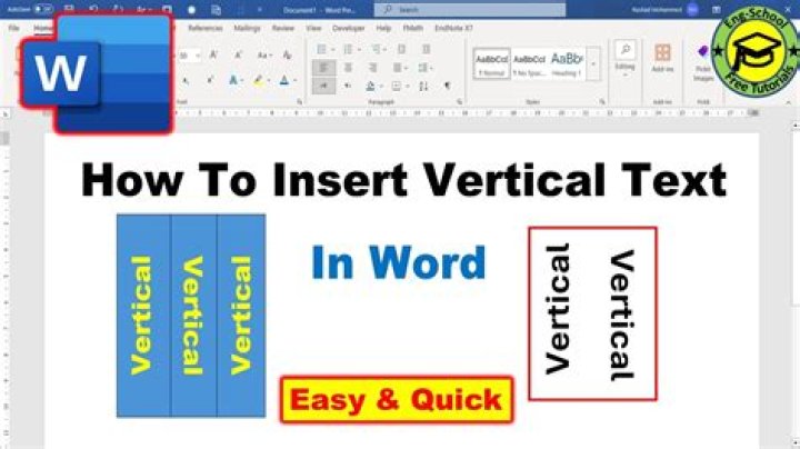
I have been trying text to go in a vertical direction like we can do in ms-word tables but so far I have only been able to do THIS... which I am not happy with because it's a box rotated... Isn't there a way to have actual vertical direction text?
I only set the rotation to 305 degrees in the demo which doesn't make the text vertical. 270deg will but I only made the demo to show rotation.
28 Answers
p { writing-mode: tb-rl; } -webkit-transform: rotate(90deg); The other answers are correct but they led to some alignment problems. On trying out different things this CSS piece code worked perfectly for me.
.vertical{ writing-mode:tb-rl; -webkit-transform:rotate(90deg); -moz-transform:rotate(90deg); -o-transform: rotate(90deg); -ms-transform:rotate(90deg); transform: rotate(90deg); white-space:nowrap; display:block; bottom:0; width:20px; height:20px; } I was searching for an actual vertical text and not the rotated text in HTML as shown below. So I could achieve it by using the following method.
HTML:-
<p> Hi This is Vertical Text! </p> CSS:-
.vericaltext{ writing-mode: vertical-lr; text-orientation: upright; } ======================= OLD Answer ==========================
HTML:-
<p> Hi This is Vertical Text! </p> CSS:-
.vericaltext{ width:1px; word-wrap: break-word; font-family: monospace; /* this is just for good looks */ } Update:- If you need the whitespaces to be displayed, then add the following property to your css.
white-space: pre;
So, the css class shall be
.vericaltext{ width:1px; word-wrap: break-word; font-family: monospace; /* this is just for good looks */ white-space: pre;/* this is for displaying whitespaces */ } JSFiddle! Demo With Whitespace
Update 2 (28-JUN-2015)
Since white-space: pre; doesnt seem to work (for this specific use) on Firefox(as of now), just change that line to
white-space: pre-wrap;
So, the css class shall be
.vericaltext{ width:1px; word-wrap: break-word; font-family: monospace; /* this is just for good looks */ white-space:pre-wrap; /* this is for displaying whitespaces including Moz-FF.*/ } To rotate text 90 degrees:
-webkit-transform: rotate(90deg); -moz-transform: rotate(90deg); -ms-transform: rotate(90deg); -o-transform: rotate(90deg); transform: rotate(90deg); Also, it appears that the span tag can't be rotated without being set to display:block.
2For vertical text with characters one below another in firefox use:
text-orientation: upright; writing-mode: vertical-rl; To display text in vertical (Bottom-top) we can simply use:
writing-mode: vertical-lr; transform: rotate(180deg); #myDiv{ text-align: center; } #mySpan{ writing-mode: vertical-lr; transform: rotate(180deg); }<div> <span> Here We gooooo !!! </span> </div>Note we can add this to ensure Browser Compatibility:
-webkit-transform: rotate(180deg); -moz-transform: rotate(180deg); -ms-transform: rotate(180deg); -o-transform: rotate(180deg); transform: rotate(180deg); we can also read more about writing-mode property here on Mozilla docs.
Try using:
writing-mode: lr-tb; #myDiv{ text-align: center; } #mySpan{ writing-mode: vertical-lr; transform: rotate(180deg); }<div> <span> Here We gooooo !!! </span> </div>
I'm new at this, it helped me a lot. Just change width, height, top and left to make it fit:
.vertical-text { display: block; position:absolute; width: 0px; height: 0px; top: 0px; left: 0px; transform: rotate(90deg); } You can also go here and see another way to do it. The author does it like this:
.vertical-text { transform: rotate(90deg); transform-origin: left top 0; float: left; } You do with this too...
.p{ writing-mode: vertical-rl; text-orientation: upright; } rotation, like you did, is the way to go - but note that not all browsers support that. if you wan't to get a cross-browser solution, you'll have to generate pictures for that.
Can use CSS3 Transform property
.txtdiv{ transform:rotate(7deg); -ms-transform:rotate(7deg); /* IE 9 */ -ms-filter: "progid:DXImageTransform.Microsoft.Matrix(M11=0.93969262, M12=0.34202014, M21=-0.34202014, M22=0.93969262,sizingMethod='auto expand')"; /* IE6-8 */ -webkit-transform:rotate(7deg); /* Opera, Chrome, and Safari */ } Add the class
.rotate { -webkit-transform: rotate(-90deg); -moz-transform: rotate(-90deg); } I use this pretty much everyday and not had any issues whatsoever with it.
I've manage to have a working solution with this :
(I have a title within a middleItem class div)
.middleItem > .title{ width: 5px; height: auto; word-break:break-all; font-size: 150%; } Here is an example of some SVG code I used to get three lines of vertical text into a table column heading. Other angles are possible with a bit of tweaking. I believe most browsers support SVG these days.
<svg height="150" width="40"> <text font-weight="bold" x="-150" y="10" transform="rotate(-90 0 0)">Jane Doe</text> <text x="-150" y="25" transform="rotate(-90 0 0)">0/0 0/0</text> <text x="-150" y="40" transform="rotate(-90 0 0)">2015-06-06</text> Sorry, your browser does not support inline SVG. </svg> You can achieve the same with the below CSS properties:
writing-mode: vertical-rl; text-orientation: upright; If you want an alignement like
S T A R T Example:
div.vertical-sentence{ -ms-writing-mode: tb-rl; /* for IE */ -webkit-writing-mode: vertical-rl; /* for Webkit */ writing-mode: vertical-rl; } .rotate-characters-back-to-horizontal{ -webkit-text-orientation: upright; /* for Webkit */ text-orientation: upright; }<div> <p><span lang="en">Whatever</span></p> <p><span lang="fr">Latin</span></p> <p><span lang="hi">वर्डप्रेस </span></p> </div>Note the Hindi has an accent in my example and that will be rendered as a single character. That's the only issue I faced with this solution.
Best solution would be to use writing-mode writing-mode: vertical-rl;
It defines whether lines of text are laid out horizontally or vertically and the direction in which blocks progress.
It has good browser support, but will not work on IE8 (if you care about IE)
.vertical-text { transform: rotate(90deg); transform-origin: left top 0; float: left; } <!DOCTYPE html> <html> <style> h2 { margin: 0 0 0 0; transform: rotate(270deg); transform-origin: top left; color: #852c98; position: absolute; top: 200px; } </style> <body> <h2>It’s all in the curd</h2> </body> </html> The text-orientation CSS property sets the orientation of the text characters in a line. It only affects text in vertical mode (when writing-mode is not horizontal-tb). It is useful for controlling the display of languages that use vertical script, and also for making vertical table headers.
writing-mode: vertical-rl; text-orientation: mixed; You can also review all the Syntax here
/* Keyword values */ text-orientation: mixed; text-orientation: upright; text-orientation: sideways-right; text-orientation: sideways; text-orientation: use-glyph-orientation; /* Global values */ text-orientation: inherit; text-orientation: initial; text-orientation: unset; You can use word-wrap:break-word to get vertical text use following snippete
HTML:
<div class='verticalText mydiv'>Here is your text</div> css:
.verticalText { word-wrap: break-word; font-size: 18px; } .mydiv { height: 300px; width: 10px; } <style> #text_orientation{ writing-mode:tb-rl; transform: rotate(90deg); white-space:nowrap; display:block; bottom:0; width:20px; height:20px; } </style> </head> <body> <p>Welcome</p> </body> h1{word-break:break-all;display:block;width:40px;} H E L L O
NOTE: Browser Supported - IE browser (8,9,10,11) - Firefox browser (38,39,40,41,42,43,44) - Chrome browser (44,45,46,47,48) - Safari browser (8,9) - Opera browser (Not Supported) - Android browser (44)
Try using an SVG file, it seems to have better browser compatibility, and won't break your responsive designs.
I tried the CSS transform, and had much trouble with the transform-origin; and ended up going with an SVG file. It took like 10 minutes, and I could control it a bit with CSS too.
You can use Inkscape to make the SVG if you don't have Adobe Illustrator.
0This works as well:
transform: rotate(90deg); You can try like this
-webkit-transform: rotate(270deg); -moz-transform: rotate(270deg); -ms-transform: rotate(270deg); -o-transform: rotate(270deg); transform: rotate(270deg); This is a bit hacky but cross browser solution which requires no CSS
<div> <div>h</div> <div>e</div> <div>l</div> <div>l</div> <div>o</div> <div>