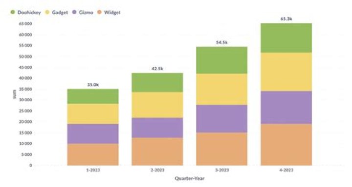
I would like to create a stacked chart using ggplot2 and geom_bar.
Here is my source data:
Rank F1 F2 F3 1 500 250 50 2 400 100 30 3 300 155 100 4 200 90 10 I want a stacked chart where x is the rank and y is the values in F1, F2, F3.
# Getting Source Data sample.data <- read.csv('sample.data.csv') # Plot Chart c <- ggplot(sample.data, aes(x = sample.data$Rank, y = sample.data$F1)) c + geom_bar(stat = "identity") This is as far as i can get. I'm not sure of how I can stack the rest of the field values.
Maybe my data.frame is not in a good format?
34 Answers
You said :
Maybe my data.frame is not in a good format?
Yes this is true. Your data is in the wide format You need to put it in the long format. Generally speaking, long format is better for variables comparison.
Using reshape2 for example , you do this using melt:
dat.m <- melt(dat,id.vars = "Rank") ## just melt(dat) should work Then you get your barplot:
ggplot(dat.m, aes(x = Rank, y = value,fill=variable)) + geom_bar(stat='identity') But using lattice and barchart smart formula notation , you don't need to reshape your data , just do this:
barchart(F1+F2+F3~Rank,data=dat) You need to transform your data to long format and shouldn't use $ inside aes:
DF <- read.table(text="Rank F1 F2 F3 1 500 250 50 2 400 100 30 3 300 155 100 4 200 90 10", header=TRUE) library(reshape2) DF1 <- melt(DF, id.var="Rank") library(ggplot2) ggplot(DF1, aes(x = Rank, y = value, fill = variable)) + geom_bar(stat = "identity") 
Building on Roland's answer, using tidyr to reshape the data from wide to long:
library(tidyr) library(ggplot2) df <- read.table(text="Rank F1 F2 F3 1 500 250 50 2 400 100 30 3 300 155 100 4 200 90 10", header=TRUE) df %>% gather(variable, value, F1:F3) %>% ggplot(aes(x = Rank, y = value, fill = variable)) + geom_bar(stat = "identity")
You will need to melt your dataframe to get it into the so-called long format:
require(reshape2) sample.data.M <- melt(sample.data) Now your field values are represented by their own rows and identified through the variable column. This can now be leveraged within the ggplot aesthetics:
require(ggplot2) c <- ggplot(sample.data.M, aes(x = Rank, y = value, fill = variable)) c + geom_bar(stat = "identity") Instead of stacking you may also be interested in showing multiple plots using facets:
c <- ggplot(sample.data.M, aes(x = Rank, y = value)) c + facet_wrap(~ variable) + geom_bar(stat = "identity")