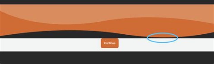
In a mobile webapp that I am currently working on I want to use a header bar with a "wavy" bottom edge. My approach to doing this is shown below.
:root { --lx-white: #fff; --lx-fontPrimary: calc(12px + ((100vh - 500px)/500)*4); --lx-fontSecondary: calc(10px + ((100vh - 500px)/500)*4); --lx-Z0: 0; --lx-Z1: 1000; --lx-small-margin: 0.5rem; --lx-std-margin: 1rem; --lx-mid-margin: 1.5rem; --lx-big-margin: 2rem; --lx-small-pad: 0.5rem; --lx-std-pad: 1rem; --lx-big-pad: 2rem; --lx-std-radius: 8px; --lx-small-radius: 4px; --lx-big-radius: 12px; --lx-orange: #de6520; --lx-light-orange: #e68a55; --lx-white: white; --lx-bg-white: #f2f4f3; --lx-light-grey: #999999; --lx-fontSize-minus1: 0.9rem; --lx-fontSize-plus1: 1.1rem; --lx-fontSize-plus2: 1.2rem; --lx-fontSize-plus3: 1.3rem; --lx-fontSize-plus5: 1.5rem; --lx-fontFace-main: 'arial'; } html, body { margin: 0; padding: 0; font-family: var(--lx-fontFace-main); } .fullScreen { height: 100vh; width: 100vw; } .scrollBox { position: relative; } .scrollContainer { position: absolute; left: 0; top: -100px; right: 0; bottom: 0; padding: var(--lx-std-pad); z-index: var(--lx-Z0); } .flexCentered { display: flex; align-items: center; justify-content: center; } .btnBox { background-color: var(--lx-bg-white); padding-bottom: var(--lx-std-pad); } button { border-style: none; border-radius: var(--lx-std-radius); background-color: var(--lx-orange); padding: var(--lx-std-pad); color: var(--lx-white); } .mainButton { font-size: var(--lx-fontSize-plus1); font-weight: bold; } .wideBtn { min-width: 60vw !important; } #tosScreen { display: grid; position: relative; grid-template-rows: 12vh 1fr 12vh; } #tosHeader { z-index: var(--lx-Z1); } #tosH1 { margin: 0; padding: 0; padding-left: var(--lx-std-pad); font-size: var(--lx-fontSize-plus3); text-align: left; background-color: var(--lx-light-orange); color: var(--lx-white); padding-top: 2rem; padding-bottom: 1rem; } #tosFooter { background-color: rgba(255, 255, 255, 0.8); z-index: var(--lx-Z1); padding-top: var(--lx-big-pad); }<div class='fullScreen' id='tosScreen'> <header id='tosHeader'> <h1 id='tosH1'>Terms of Service</h1> <svg viewBox="0 0 375 56" xmlns="" xml:space="preserve"><path d="M-.171-.059h374.734v36.17H-.171z" transform="matrix(1.00071 0 0 1 .172 .059)"/><path d="M375 148.52v8.36c-33.3 9.15-90 18.28-165.06 6.51-83.31-13.08-164.87-3.78-209.94 3.87v-54.17c.5 6.13.78 9.61.78 9.61s65 38.28 174.47 18.69c84.12-15.06 166.21-.45 199.75 7.13Z" transform="translate(0 -113.031)"/></svg> </header> <div class='scrollBox'> <div class='scrollContainer' id='termsScroller'> </div> </div> <footer id='tosFooter'> <div class='btnBox flexCentered'> <button id='btnContinue' class='wideBtn mainButton'>Continue</button> </div> </footer> </div>When I view this in Chrome and in Opera with the display toggled to simulate a mobile screen I see a faint white line separating the header and the SVG below it. This does not appear to happen on Edge. I can't be bothered testing this on Firefox - not relevant to my project anyway.
What is causing this?
In the screenshot above I have attempted to highlight the location of the line in the dotted blue rectangle
11 Answer
I'm not sure if this is the is the space you are referring to - if so it is caused by the svg being an inline element. Try changing it to block - and the space should be gone
svg { display: block; } 
If related to shape rendering - try adding shape-rendering="crispEdges" to the first path in the svg
<path d="M-.171-.059h374.734v36.17H-.171z" transform="matrix(1.00071 0 0 1 .172 .059)" shape-rendering="crispEdges" /> Edit - I ran a few optimizations using SVGOMG to simplify the shapes - maybe that will work too
<svg xmlns="" viewBox="0 0 375 56"> <path fill="#E68A55" d="M0 0h375v36.2H0z"/> <path fill="#DE6520" d="M375 35.5v8.3c-33.3 9.2-90 18.3-165 6.6-83.4-13.1-165-3.8-210 3.8V9.1l.8.6s65 38.2 174.4 18.7c84.2-15.1 166.3-.5 199.8 7Z"/> </svg>