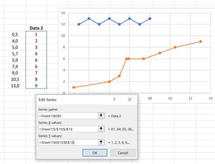
Have several series of data I want to plot on the same chart:
Series A X Y 4015188 7361762 4020374 9581526 4022289 10649655 4023878 11223132 4025512 12035416 4028600 13408580 4030353 14233259 Series B X Y 689673 10918805 691097 11241203 691632 11510570 692105 11779503 692555 12044321 693475 12574225 694068 12847928 694512 12874474 695523 13412715 696015 13681729 696525 13950947 698062 14758546 So want to plot these as scatter/line graph, on the X/Y axis. Each series should be represented by a different color. How do I do this?
33 Answers
An alternative... Adjust your data:
Series A 4015188 7361762 4020374 9581526 4022289 10649655 4023878 11223132 4025512 12035416 4028600 13408580 4030353 14233259 Series B 689673 10918805 691097 11241203 691632 11510570 692105 11779503 692555 12044321 693475 12574225 694068 12847928 694512 12874474 695523 13412715 696015 13681729 696525 13950947 698062 14758546 Select the series A data, including the first row with the blank cell and "Series A" label, and insert your XY Scatter chart, using the option with lines and markers.
Select and copy the series B data, including the first row with the blank cell and "Series B" label, select the chart, and click on Paste Special from the Paste button down arrow on the Home tab. Choose New Series, Values in Columns, Series Names in First Row, and X Values in First Column.
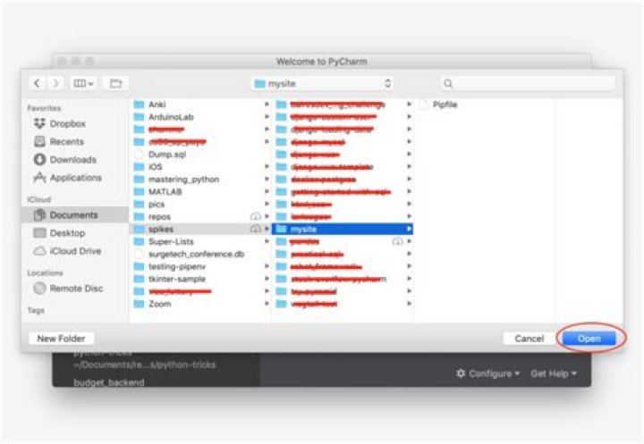
I've recently written Multiple Series in One Excel Chart, a tutorial describing this technique.
7Here is one solution; discuss:
X Y1 Y2 4015188 7361762 4020374 9581526 4022289 10649655 4023878 11223132 4025512 12035416 4028600 13408580 4030353 14233259 689673 10918805 691097 11241203 691632 11510570 692105 11779503 692555 12044321 693475 12574225 694068 12847928 694512 12874474 695523 13412715 696015 13681729 696525 13950947 698062 14758546 Excel will happily plot this.
5This is essentially the same answer as this one above, but using Office365Pro,
Excel Version 2002 Build 12527.21236
Step by step
- Arrange data in separate junks like in the example below.
- Select one of those

- Insert a default XYScatter plot
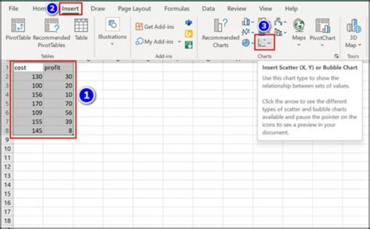
- Right click the data area of the plot and select
Select Data...

- Click the
Addbutton to add a series

- Use the pop-up dialog to specify the three ranges for the label, the X and the Y values

That's it.
Note one pit-fall: If your X-values contain non-numeric fields, then the whole x-axis will be interpreted as counted and you might see a plot like this: