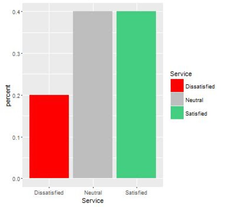
I'm struggling with how to manually change bar colours in ggplot2. Strangely, I can get it to work when using more complicated formats that require a legend by using scale_fill_manual and setting the values,labels, etc. But when creating a simpler chart that doesn't require a legend, I can't seem to get it to work. Below is a sample data frame, the steps I used in dplyr to get the percentages, and how I think it should work in ggplot2. I just want to manually change the bar colours to red, seagreen3, and grey.
Any help would be appreciated. I'm also curious to know different ways that are used to quickly calculate percentages. I've been using piping with dplyr, but if would be great to see other ways of writing code.
library(dplyr) library(ggplot2) Service <- c("Satisfied", "Dissatisfied", "Neutral", "Satisfied", "Neutral") Service2 <- c("Dissatisfied", "Dissatisfied", "Neutral", "Satisfied", "Satisfied") Services <- data.frame(Service, Service2) ServicesProp <- Services %>% select(Service) %>% group_by(Service) %>% summarise(count=n()) %>% mutate(percent = count / sum(count)) ggplot(ServicesProp, aes(x = Service, y = percent)) + geom_bar(stat = "identity", position = "dodge") + scale_fill_manual(values = c("red", "seagreen3", "grey")) 1 Answer
Just in case you are not sure what @baptise means:
ggplot(ServicesProp, aes(x = Service, y = percent, fill = Service)) + geom_bar(stat = "identity", position = "dodge") + scale_fill_manual(values = c("red", "grey", "seagreen3"))