
I have a dashboard with a typical bar chart that only has 'Inside End' labels on it (percentages usually). This dashboard is can vary depending on which variable I pick (i.e. if I pick a different city, the bar chart percentages will change for that specific city).
However, sometimes changing a variable will output a bar chart with a very small percentage, making it very hard to fit or see the 'Inside End' label.
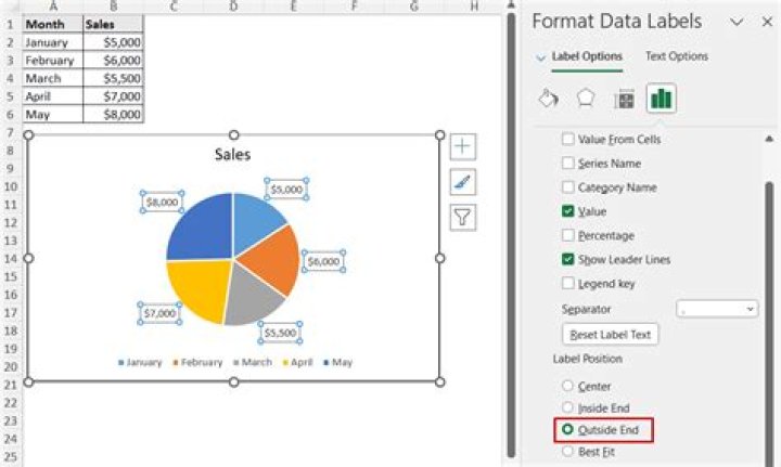
Is it possible to be able to make those specific cases an 'Outside End' label, whilst having the rest of the bars that are visible in the chart 'Inside End'?
Let me know if I can make this question clearer.
EDIT: Some people have asked for a screenshot, hopefully this link works:
41 Answer
Is it possible to be able to make those specific cases an 'Outside End' label
AFAIK, automatically? No. IMHO, I'll do it manually though, in two possible ways :
To scale the max y-axis to 70% instead of the applied 100% >> this will make all Inside end % visible.
Or, proceed with Inside End option. Select the only the 'misaligned' percentage label, then move it manually. Apply different color if needed.
That works for me. Eg. here