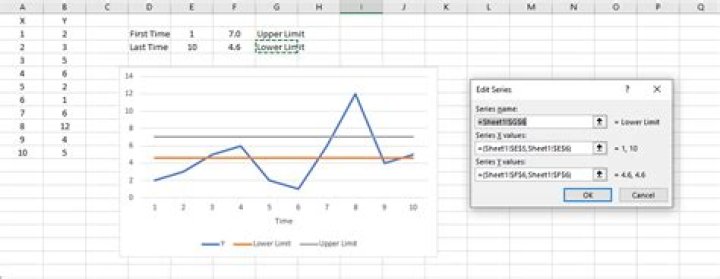
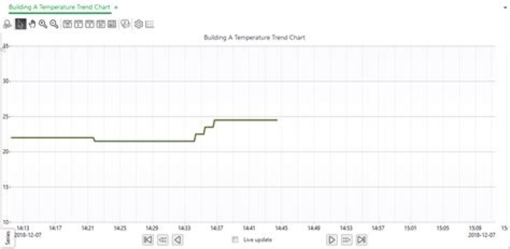
I would like to plot a time series with two horizontal lines (depicting limits in my case).
How do I do this?
Example of what I'm trying to achieve (horizontal lines drawn in Paint):
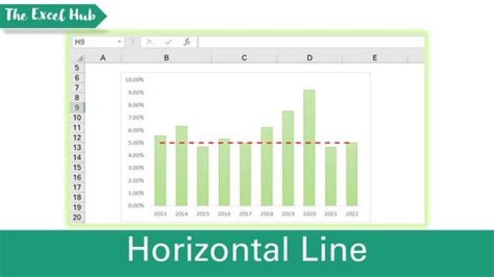
2 Answers
There are 2 ways that I know of to do this, the first is essentially as advised by @Thales, just including more detail.
FIRST APPROACH
- Include 2 new columns I labelled these UCL and LCL for upper control limit and lower control limit respectively.
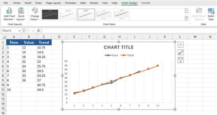
- Shade all 4 columns and select Insert > Charts (select Scatter Chart) as shown in the figure below:
- Re-position the graph, then Right click on each horizontal series and format the data series change the color and set the marker to 'None'.

THE SECOND WAY (My Personal Preference)...
If you do not want to add the columns you can do the following:
- Once you have your base chart without the horizontal lines, right click the chart and click 'Select Data...'
- Under 'Legend Entries (Series)' select the 'Add' button
- Name the series
- enter ={1,20} in the Series X values field - this is the start and end values for the x range
- enter ={4,4} in the Series Y values field - these are the corresponding Y values see below
- Repeat for the other horizontal line using values ={1,20} for the X Series and ={2,2} for the Y Series.
- Next format the lines as described above and there you have it a chart without the need to add another series.
There's a Third Way and I believe is the best way to do this.
Use the same method as described in the Second Way, except do as shown in the image below:
Example of adding Upper and Lower limits using cell references
2