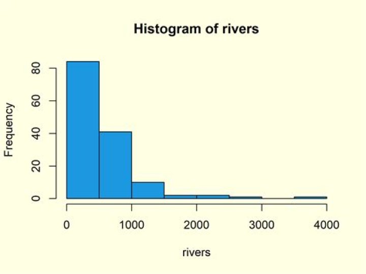

I have a set of N objects with two properties: x and y. I would like to depict the distribution of x with a histogram in MATPLOTLIB using hist(). Easy enough. Now, I would like to color-code EACH bar of the histogram with a color that represents the average value of y in that set with a colormap. Is there an easy way to do this? Here, x and y are both N-d numpy arrays. Thanks!
fig = plt.figure() n, bins, patches = plt.hist(x, 100, normed=1, histtype='stepfilled') plt.setp(patches, 'facecolor', 'g', 'alpha', 0.1) plt.xlabel('x') plt.ylabel('Normalized frequency') plt.show() 1 Answer
import numpy as np import matplotlib import matplotlib.pyplot as plt # set up the bins Nbins = 10 bins = np.linspace(0, 1, Nbins +1, endpoint=True) # get some fake data x = np.random.rand(300) y = np.arange(300) # figure out which bin each x goes into bin_num = np.digitize(x, bins, right=True) - 1 # compute the counts per bin hist_vals = np.bincount(bin_num) # set up array for bins means = np.zeros(Nbins) # numpy slicing magic to sum the y values by bin means[bin_num] += y # take the average means /= hist_vals # make the figure/axes objects fig, ax = plt.subplots(1,1) # get a color map my_cmap = cm.get_cmap('jet') # get normalize function (takes data in range [vmin, vmax] -> [0, 1]) my_norm = Normalize() # use bar plot ax.bar(bins[:-1], hist_vals, color=my_cmap(my_norm(means)), width=np.diff(bins)) # make sure the figure updates plt.draw() plt.show() related: vary the color of each bar in bargraph using particular value
2