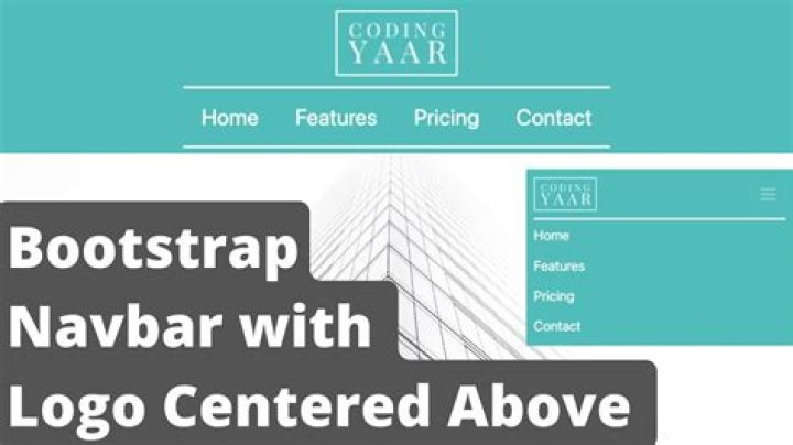
I am trying to implement a Bootstrap 3 navbar so that the brand logo to always remain in the middle. This is the code:
<div> <div> <div> <button type="button"> <span></span> <span></span> <span></span> </button> <a href="#"> <img src="/Content/themes/next/images/logo.png" /></a> <div> <ul> <li> <a href="#">Item 1</a></li> <li> <a href="#">Item 1</a></li> <li> <a href="#">Item 1</a></li> </ul> </div> <ul> <li> <a href="#"> <div></div> </a> </li> </ul> <span>superpup1 </span> </div> </div> </div>It makes a nice looking navbar: 
However, I would like the logo (green) remain in the middle persistently. I am adding this style to the tag with "brand" class:
<a href="#"> <img src="/Content/themes/next/images/logo.png" /> </a> It partially solves the problem: the logo is in the middle but it pushes the rest of the navbar elements down:
This is an undesirable effect that I would like to eliminate. Could you suggest a solution? Maybe it's a wrong approach to centering a logo from the start ?
17 Answers
Try this:
.navbar { position: relative; } .brand { position: absolute; left: 50%; margin-left: -50px !important; /* 50% of your logo width */ display: block; } Centering your logo by 50% and minus half of your logo width so that it won't have problem when zooming in and out.
See fiddle
4The simplest way is css transform:
.navbar-brand { transform: translateX(-50%); left: 50%; position: absolute; } 
This way also works with dynamically sized background images for the logo and allows us to utilize the text-hide class:
CSS:
.navbar-brand { background: url() center / contain no-repeat; transform: translateX(-50%); left: 50%; position: absolute; width: 200px; /* no height needed ... image will resize automagically */ } HTML:
<a href="">Brand Text </a> We can also use flexbox though. However, using this method we'd have to move navbar-brand outside of navbar-header. This way is great though because we can now have image and text side by side:

.brand-centered { display: flex; justify-content: center; position: absolute; width: 100%; left: 0; top: 0; } .navbar-brand { display: flex; align-items: center; } To only achieve these results on mobile simply wrap the above css inside a media query:
@media (max-width: 768px) { } Bootstrap 5 (update 2022)
In Bootstrap 5, mx-auto or flexbox justify-content-center can still be used to center the brand and other elements.
Bootstrap 4 (update 2018)
In Bootstrap 4, mx-auto or flexbox can be used to center the brand and other elements. See How to center position navbar content in Bootstrap for an explanation.
Bootstrap 3 (original answer)
The brand is centered using..
.navbar-brand { position: absolute; width: 100%; left: 0; top: 0; text-align: center; margin: auto; } Your markup is for Bootstrap 2, not 3. There is no longer a navbar-inner.
EDIT - Another approach is using transform: translateX(-50%);
.navbar-brand { transform: translateX(-50%); left: 50%; position: absolute; } Also see:
Bootstrap NavBar with left, center or right aligned items
1Old question, but just for posterity.
I've found the easiest way to do it is to have the image as the background image of the navbar-brand. Just makes sure to put in a custom width.
.navbar-brand { margin-left: auto; margin-right: auto; width: 150px; background-image: url('logo.png'); } <style> .navbar-brand { margin: auto; } </style> <!--HTML--> <nav> <a href="#"> <img src="logo goes here" width="100" height="100" alt="" loading="lazy"> </a> </nav> A solution where the logo is truly centered and the links are justified.
The max recommended number of links for the nav is 6, depending on the length of the words in eache link.
If you have 5 links, insert an empty link and style it with:
class="hidden-xs" in this way the number of links is always even.
<link href="" rel="stylesheet"/> <style> .navbar-nav > li { float: none; vertical-align: bottom; } #site-logo { position: relative; vertical-align: bottom; bottom: -35px; } #site-logo a { margin-top: -53px; } </style> <nav> <div> <div> <button type="button" aria-expanded="false" aria-controls="navbar"> <span>Nav</span> <span></span> <span></span> <span></span> </button> </div> <div> <ul> <li><a href="#">First Link</a></li> <li><a href="#">Second Link</a></li> <li><a href="#">Third Link</a></li> <li><a href="#"><img src="" width="200" alt="Logo Thing main logo"></a></li> <li><a href="#">Fourth Link</a></li> <li><a href="#">Fifth Link</a></li> <li><a href="#">Sixth Link</a></li> </ul> </div> </div> </nav> <script src=""></script> <script src=""></script>To see result click on run snippet and then full page
As it's a flexbox (and probably due to a justify-content:space-between BT4 css prop.), if you add a third element, sibling of the name and the button, it wil naturaly centering the second element in the code.
I just add <span>login</span> just after the a
<link href="" rel="stylesheet"/> <nav> <button type="button" aria-controls="navbarSupportedContent" aria-expanded="false" aria-label="Toggle navigation"> <span></span> </button> <a href="#">Navbar</a> <span>login</span> <div> <ul> <li> <a href="#">Home <span>(current)</span></a> </li> </ul> <form> <input type="search" placeholder="Search" aria-label="Search"> <button type="submit">Search</button> </form> </div> </nav>