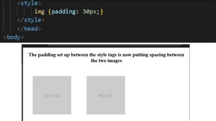

I want 3 images side by side with caption, at the moment I have 3 images going from top to bottom, with the caption on the left, not on the centre. How do I make the images appear side by side with caption in the middle? Thanks.
<div> <img src="/images/tv.gif" height="200" width="200"> <p>This is image 1</p> <img src="/images/tv.gif"/ height="200" width="200"> <p>This is image 2</p> <img src="/images/tv.gif"/ height="200" width="200"> <p>This is image 3</p> </div> 7 Answers
You mean something like this?
<div> <div> <img src="/images/tv.gif" height="200" width="200"/> <p>This is image 1</p> </div> <div> <img src="/images/tv.gif"/ height="200" width="200"/> <p>This is image 2</p> </div> <div> <img src="/images/tv.gif"/ height="200" width="200"/> <p>This is image 3</p> </div> </div> with the imgContainer style as
.imgContainer{ float:left; } Also see this jsfiddle.
8Not really sure what you meant by "the caption in the middle", but here's one solution to get your images appear side by side, using the excellent display:inline-block :
<!DOCTYPE html> <html> <head> <meta charset=utf-8 /> <title></title> <style> div.container { display:inline-block; } p { text-align:center; } </style> </head> <body> <div> <img src="" height="200" width="200" /> <p>This is image 1</p> </div> <div> <img src=""/ height="200" width="200" /> <p>This is image 2</p> </div> <div> <img src="" height="200" width="200" /> <p>This is image 3</p> </div> </div> </body> </html> Try using this format
<figure> <img src="img" alt="The Pulpit Rock" width="304" height="228"> <figcaption>Fig1. - A view of the pulpit rock in Norway.</figcaption> </figure> This will give you a real caption (just add the 2nd and 3rd imgs using Float:left like others suggested)
I suggest to use a container for each img p like this:
<div> <div> <img src="/images/tv.gif" height="200" width="200" /> <p>This is image 1</p> </div> <div> <img src="/images/" height="200" width="200" /> <p>This is image 2</p> </div> <div> <img src="/images/" height="200" width="200" /> <p>This is image 3</p> </div> </div> Then apply float:left to each container. I add and 5px margin right so there is a space between each image. Also alway close your elements. Maybe in html img tag is not important to close but in XHTML is.
Also a friendly advice. Try to avoid inline styles as much as possible. Take a look here:
html
<div> <div> <img src="/images/tv.gif" /> <p>This is image 1</p> </div> <div> <img src="/images/" /> <p>This is image 2</p> </div> <div> <img src="/images/" /> <p>This is image 3</p> </div> </div> css
div{ float:left; margin-right:5px; } div > img{ height:200px; width:200px; } p{ text-align:center; } It's generally recommended that you use linked style sheets because:
- They can be cached by browsers for performance
- Generally a lot easier to maintain for a development perspective
Try this.
CSS
.imageContainer { float: left; } p { text-align: center; } HTML
<div> <div> <img src="/images/tv.gif" height="200" width="200" /> <p>This is image 1</p> </div> <div> <img src="/images/tv.gif"/ height="200" width="200" /> <p>This is image 2</p> </div> <div> <img src="/images/tv.gif"/ height="200" width="200"/> <p>This is image 3</p> </div> </div> Here is how I would do it, (however I would use an external style sheet for this project and all others. just makes things easier to work with. Also this example is with html5.
<!DOCTYPE html> <html> <head> <meta charset="utf-8"> <title></title> <style> .container { display:inline-block; } </style> </head> <body> <div> <figure> <img src="" height="200" width="200"> <figcaption>This is image 1</figcaption> </figure> <figure> <img src=""/ height="200" width="200"> <figcaption>This is image 2</figcaption> </figure> <figure> <img src="" height="200" width="200"> <figcaption>This is image 3</figcaption> </figure> </div> </body> </html> In your CSS:
.image123{ float:left; }